
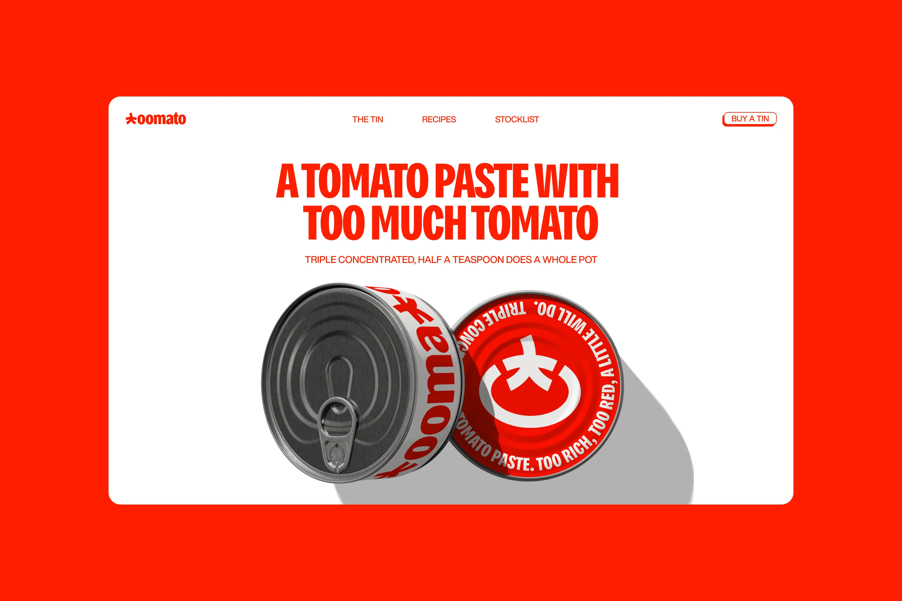







A tomato paste with too much tomato
Tomato paste does important work quietly, building depth in sauces, soups, beans, and stews. Most brands in the category lean on red packaging and Italian heritage cues. Toomato's triple-concentrated paste stood apart: intense flavor from a small amount.
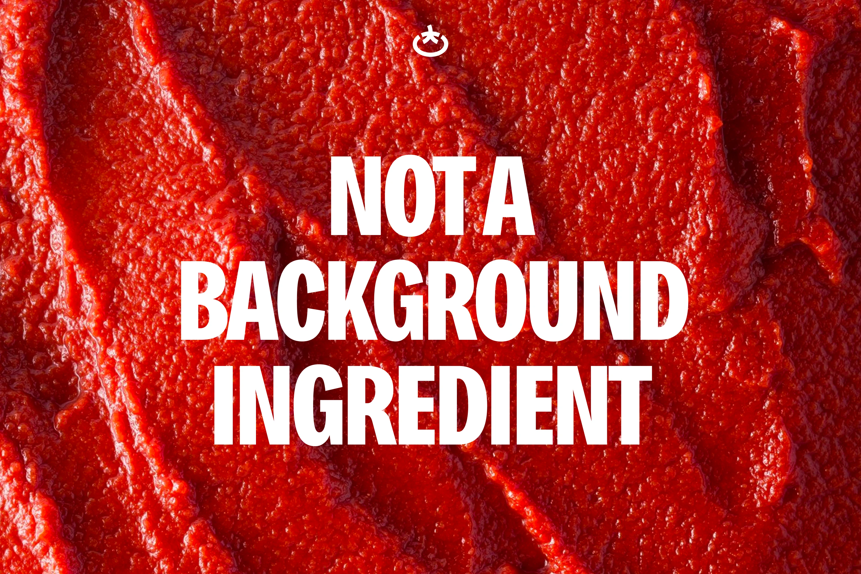
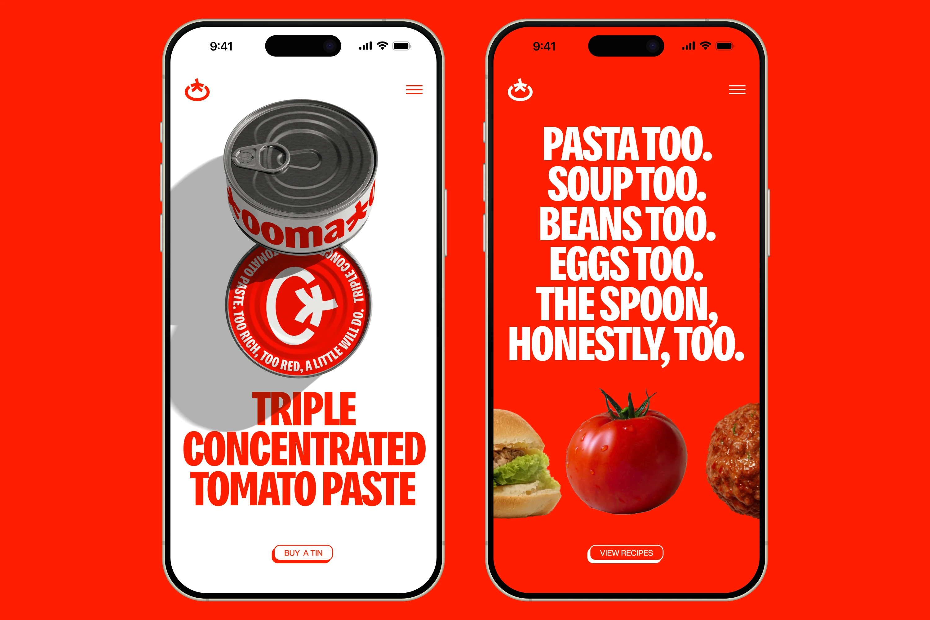
We positioned the brand as a small ingredient with an outsized presence. We named it Toomato, adding an extra "o" to "tomato" to make "too much" a compliment. "Too much tomato" set the attitude, "triple concentrated" grounded it in the product, and "use less" expressed the practical promise.
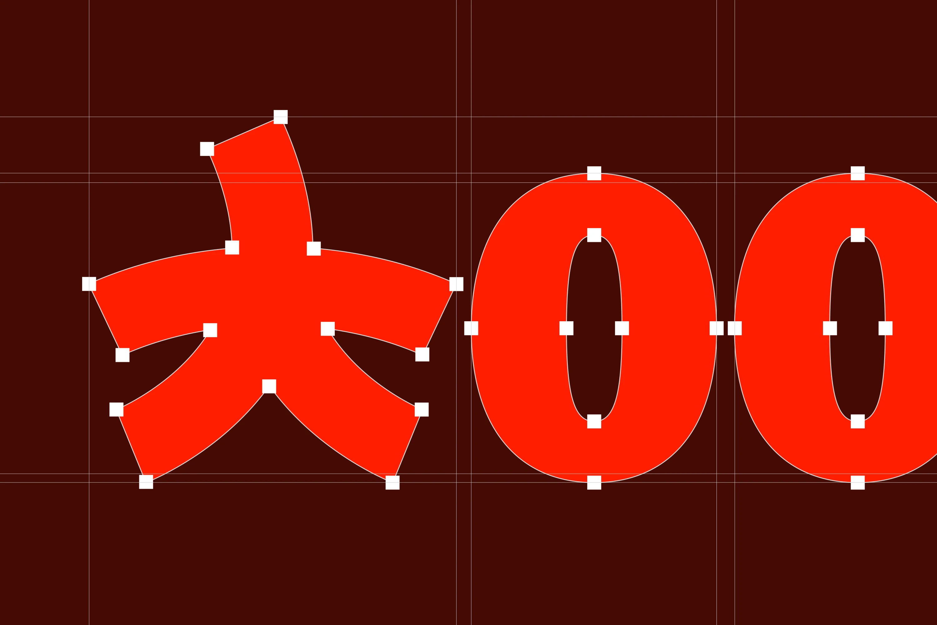
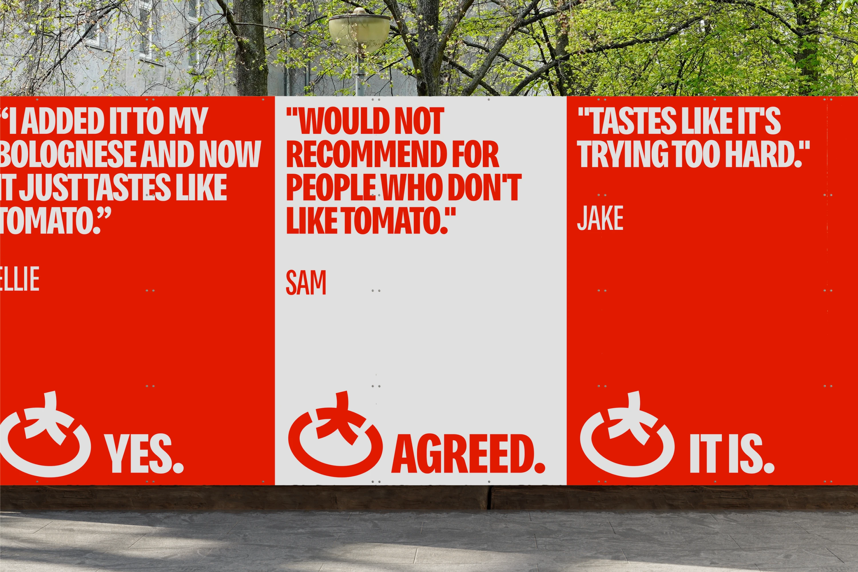
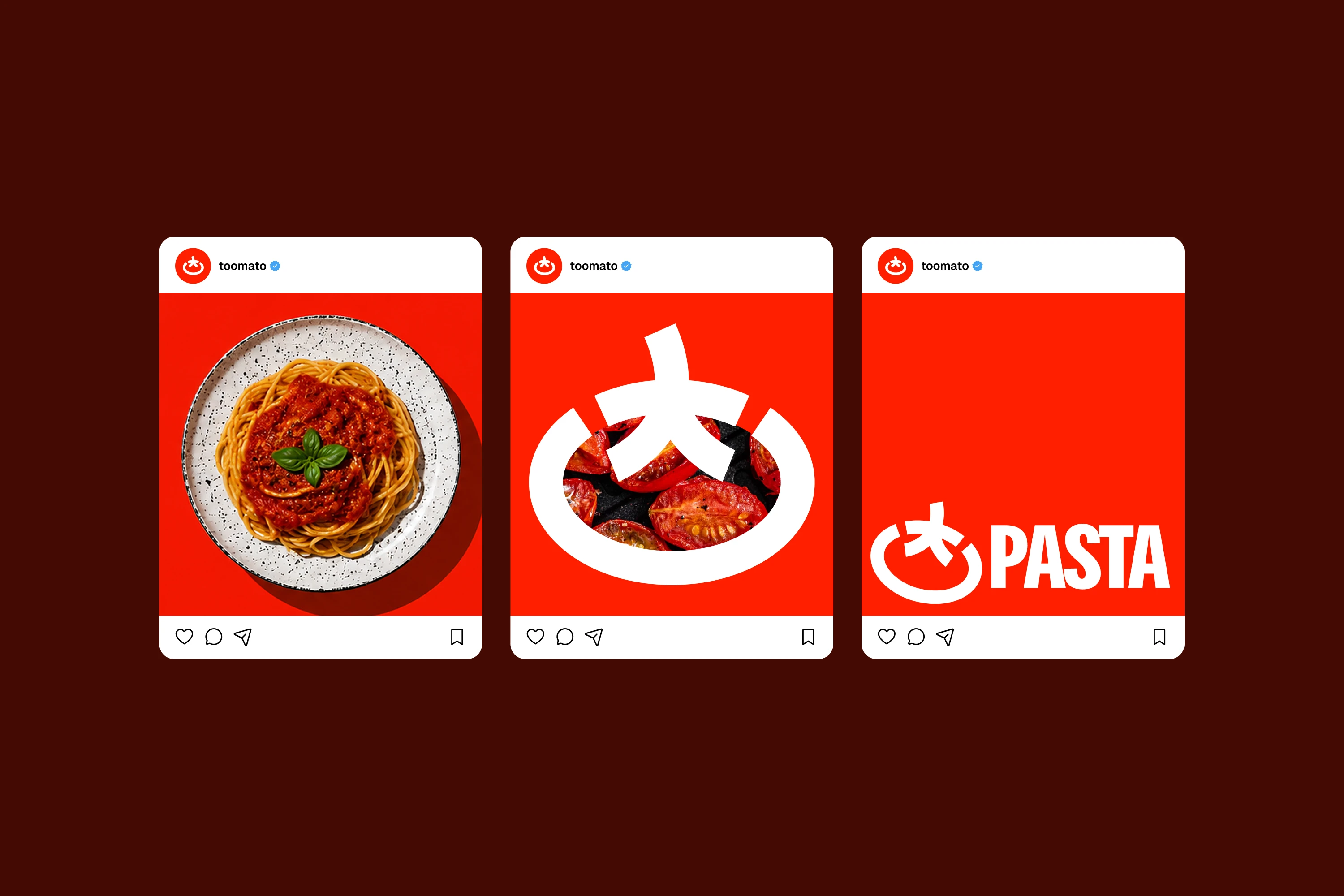
The identity made concentration visible. We reduced the tomato to a ring and stem, the palette to a single unapologetic red, and the language to short, emphatic statements. A bold, condensed typeface gave them impact on shelf and street. These choices gave a quietly powerful ingredient a presence to match.